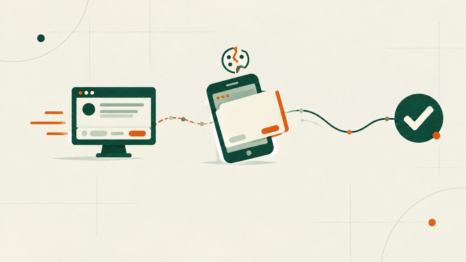
A banner that's fully compliant on desktop can quietly fail on mobile — not because the underlying CMP configuration changes, but because mobile screens expose layout problems desktop never surfaces.
The viewport-clipping problem
The single most common mobile-specific failure: the "Reject all" button exists in the banner's markup and is configured correctly, but on a small viewport it's pushed below the visible fold, behind a scroll the banner's own container doesn't support, or clipped by a fixed-position header/footer the CMP template didn't anticipate. Technically present, practically inaccessible — and the distinction matters legally, not just functionally: a reject option a visitor can't actually reach doesn't satisfy the "equal prominence" requirement any better than one that was never built.
Why this slips through QA
Most cookie-banner testing happens on desktop, where the CMP vendor's default template was designed and tested. A site's own QA process, if it checks the banner at all, often does the same — desktop browser, default zoom, done. Real mobile traffic runs across a much wider range of actual viewport heights (especially with mobile browser chrome collapsing/expanding on scroll), and a banner that fits in one common size can clip in another.
Touch-target size is a second, separate issue
Even when both buttons are visible, mobile accessibility guidelines call for touch targets of roughly 44×44px minimum. A banner styled for desktop mouse clicks often ships reject/accept buttons well under that on mobile — technically clickable, but easy to mis-tap, which creates a different kind of "friction asymmetry" between the two choices if one button is noticeably easier to hit accurately than the other.
What to actually check
- Load your site on an actual phone (not just a resized desktop browser window) and confirm both buttons are visible without scrolling, on first load
- Try a few different real device sizes if you can — a small older phone and a larger current one behave differently
- Tap-test both buttons without zooming in first
The fix is usually CMP configuration, not a rebuild
Most CMPs support a compact/mobile-specific banner layout as a configuration option, not something requiring custom development — the fix is frequently just enabling and testing it, not redesigning the banner from scratch.
Bannerproof scans render the page the way a real visitor's browser would, catching layout-driven banner failures that a desktop-only check misses. The first scan is free.
This article is informational, not legal advice. Bannerproof is an independent scanning tool, not a law firm or a data protection authority — see our Terms of Service for details.